Ensweet
Ensweet is a French health tech startup making cardiac rehabilitation accessible from home. I spent two years there as the sole product designer: research, rebrand, design system, and the product itself, end to end.
Product Designer · Art direction & product · Ensweet · 2022 – 2024
The context
Cardiac rehabilitation works. Getting to a specialized center is another story: too far, too slow, not enough places. Ensweet's answer is a home-based program that connects each patient to a real care team.
When I joined, the product existed but had grown feature by feature. My mandate was to realign it with what users actually need: a product that is easier to use, innovation aimed at real unsolved problems, and fewer costly development detours, because users give their feedback before the code is written, not after.
Listening first
I started with research, both qualitative and quantitative: user interviews, card sorting, feedback analysis, data reports. The insights themselves are confidential, but they set the direction for everything that follows.
Two users, one product
The research kept pointing at the same tension. Ensweet serves two people at once: the patient recovering at home, and the caregiver monitoring dozens of patients at a distance. They share the same goal and almost nothing else.
The problem statement
How do you make one product serve a patient recovering at home and a caregiver monitoring dozens of them, without compromising either experience?
Three pillars
The ideation phase went wide on purpose: brainstorming, sketches, quick feedback rounds, deliberately unreasonable ideas. Two concepts survived the sorting. An ultra-personalized activity program that caregivers can adjust in a few taps, and therapeutic education turned into a game, with quizzes prepared on the caregiver side.
From there, the product settled on three pillars. They structured every design decision that followed.
A new identity
The product needed a brand that could carry it. I led a complete rebrand: Montserrat for its open, rounded shapes, and a palette built around a deep blue, softened by lighter tones. Medical enough to be trusted, warm enough to be opened every day.
Adapted physical activity
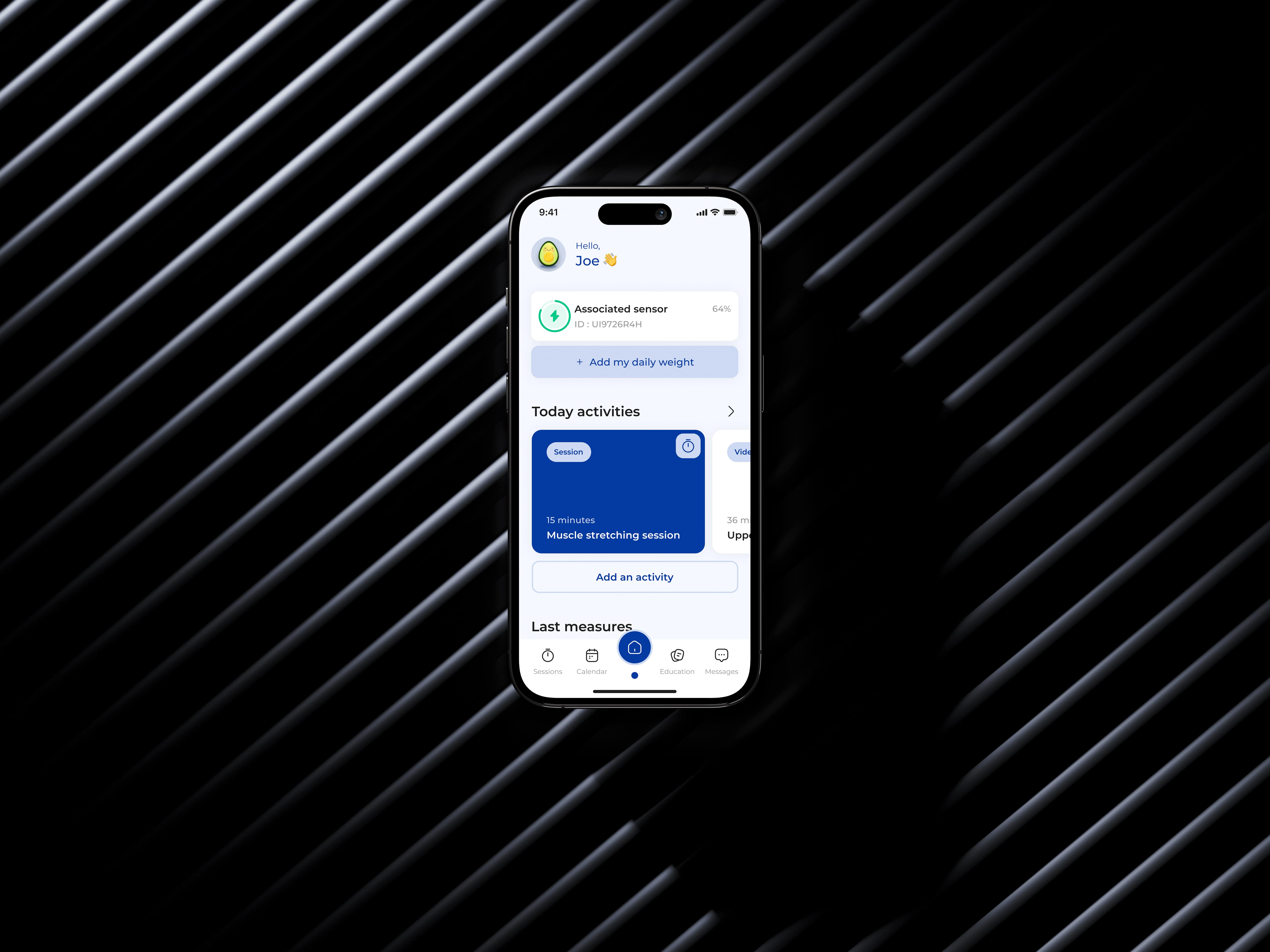
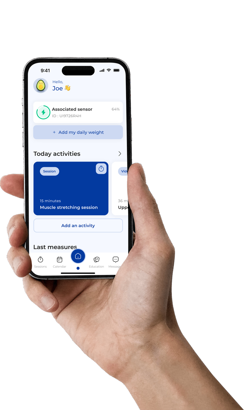
The patient's home screen holds the whole promise: today's session, the connected sensor, the daily weight. The program adapts to each patient's abilities, so progress stays steady and safe. Nothing to configure, nothing to guess.
Therapeutic education
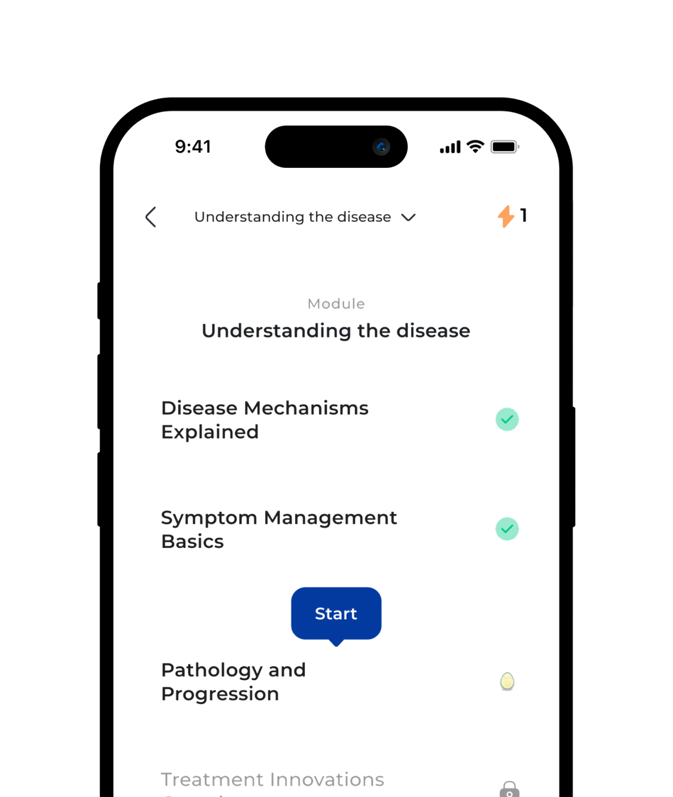
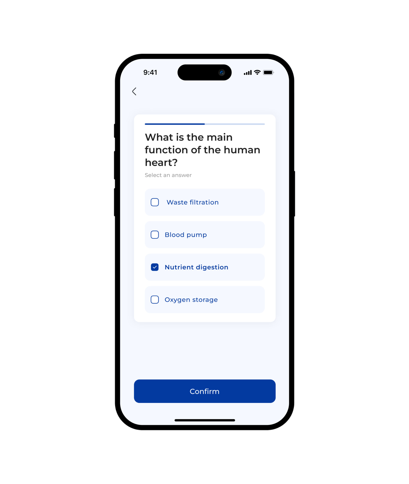
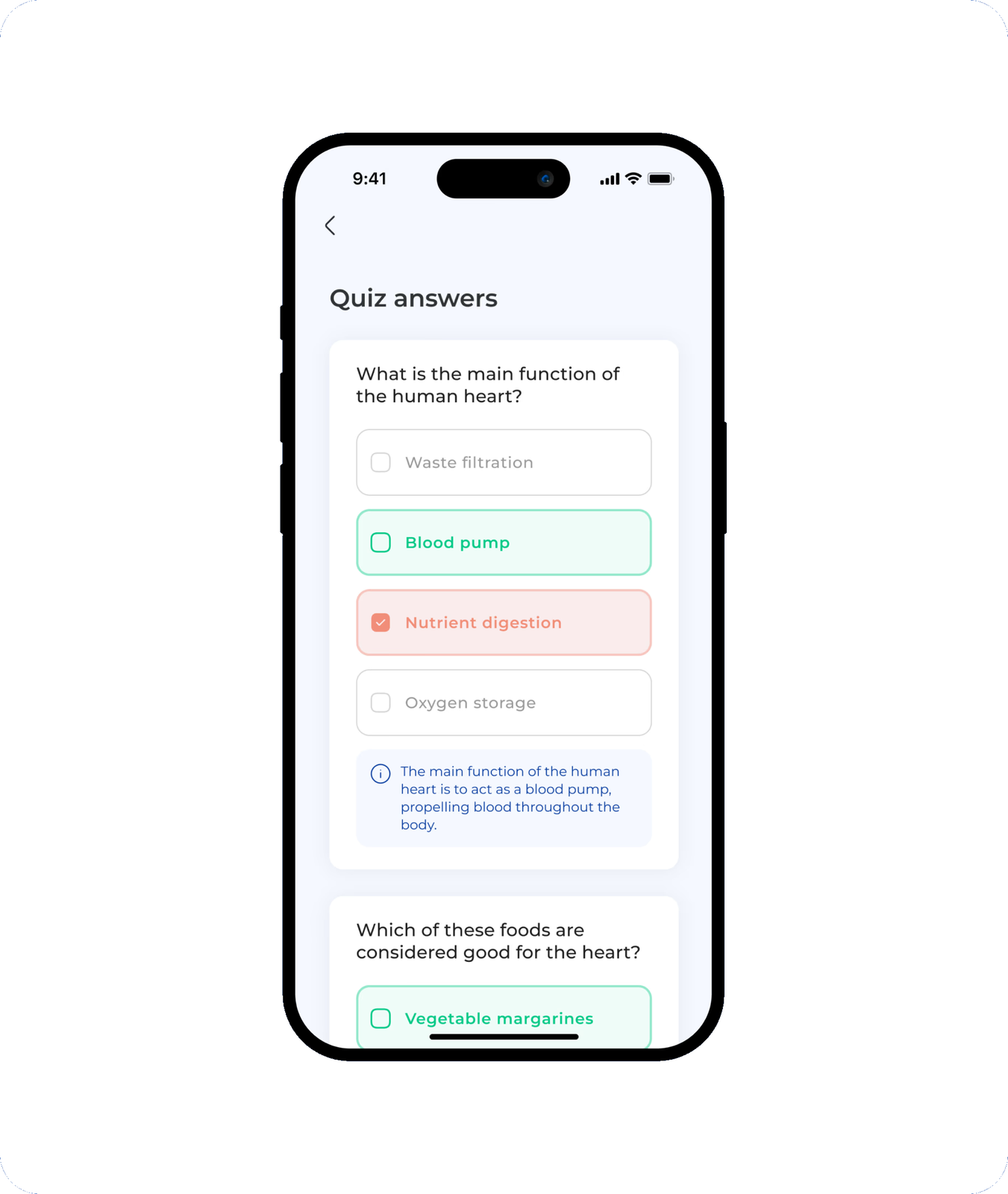
Understanding the disease is part of the treatment. The education modules unfold as a path: short lessons, then a quiz. Answers come back with an explanation, not just a score, so patients learn the why, not only the what. On the caregiver side, the quizzes come pre-designed and ready to assign.
Prototype · try it
What is the main function of the human heart?
Personalized follow-up
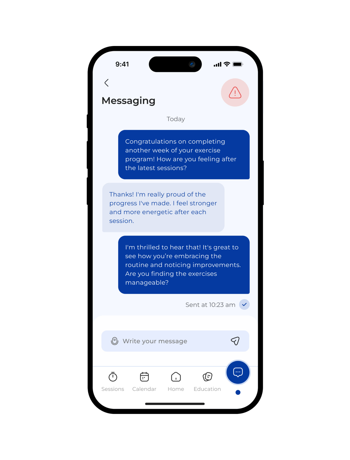
Between two sessions, the link with the care team stays open. Messaging keeps the conversation human, and an alert button is always within reach. For the patient, it cuts through the isolation of recovering at home. For the caregiver, it means adjusting the program in real time instead of discovering a problem at the next appointment.
Validate, then validate again
Nothing shipped on intuition alone. A/B tests, usability testing, data analysis, and user feedback shaped each iteration. The product was refined release after release, against what patients and caregivers actually did with it.
What I took away
Two years as the only designer taught me to build the foundations while shipping: the design system and the brand grew alongside the product, not before it. And the most important design decision was never a screen. It was accepting that the patient's simplicity and the caregiver's density are two different experiences, and designing one system honest enough to serve both.
Next project
The audioguide that disappears