Tinkle
Nobody was solving the real problem with buying art online. The platforms were optimized for transactions, not for the doubt that happens before one. With Noé we wanted to understand that doubt, so we built a project around it. 50 survey respondents, individual interviews, market analysis, and a product designed from what we found. Mentored by David Taing (Google / YouTube).
Design & Research · With Noé Chagué (Bitstack) · Mentor : David Taing (Google) · 2023
Why we started this
We were frustrated by the gap between how people talk about art and how platforms let them buy it. Online art sales had reached $10.8 billion. 78% of buyers had purchased online. Yet 70% still feared the piece would look different in person. The industry was growing fast and failing at the most basic thing: trust.
We didn't want to design another marketplace. We wanted to understand why the existing ones weren't working, and see if the answer would lead somewhere different. With Noé we decided to treat it like a real product: full research, real users, no shortcuts.
What 50 buyers actually told us
We started with three hypotheses. Would hyper-personalization change discovery? Could short-term rental lower the barrier? Would combining both create something new? Instead of assuming, we surveyed 50 art buyers.
Two numbers shaped everything after: 64% were interested in renting art before buying, and only 27% felt they had good ways to discover new artists. The demand was there. The tools were not.
Two buyer archetypes emerged. Online buyers valued convenience and curation. In-person buyers needed to see the work with their own eyes. We ran individual interviews with the second group, the harder audience. Their resistance wasn't about technology. It was about not being able to judge scale, texture, and color through a screen. That distinction changed the entire product direction.
The bet
Most art platforms treat the transaction as the product. We bet on something else: the product is the space between discovering a piece and deciding to live with it. That space needed three things. Personalization that starts before the first scroll. A way to commit without the permanence of buying. And direct access to the artist, not a storefront.
The version we threw away
Our first iteration was a classic marketplace with filters and categories. It checked every box on paper. But when we tested the flows against our interview transcripts, something was off. The in-person buyers we had spoken to would never start their journey from a search bar. They start from a place, a mood, a conversation with someone. We were designing for how platforms work, not for how people actually find art.
We scrapped the information architecture and rebuilt it around the two archetypes. That cost us a week. It also gave us the product.
No cold start
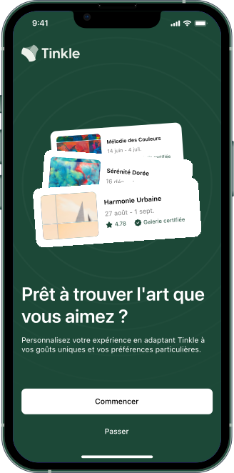
Every buyer we interviewed complained about generic feeds. The first screen of Tinkle is a taste quiz: art experience, emotional response to styles, then a swipe-based selection on real artworks. Every answer trains the feed, the map, and the artist suggestions. By the time you reach the home screen, the app already knows something about you.
Two archetypes, three entry points
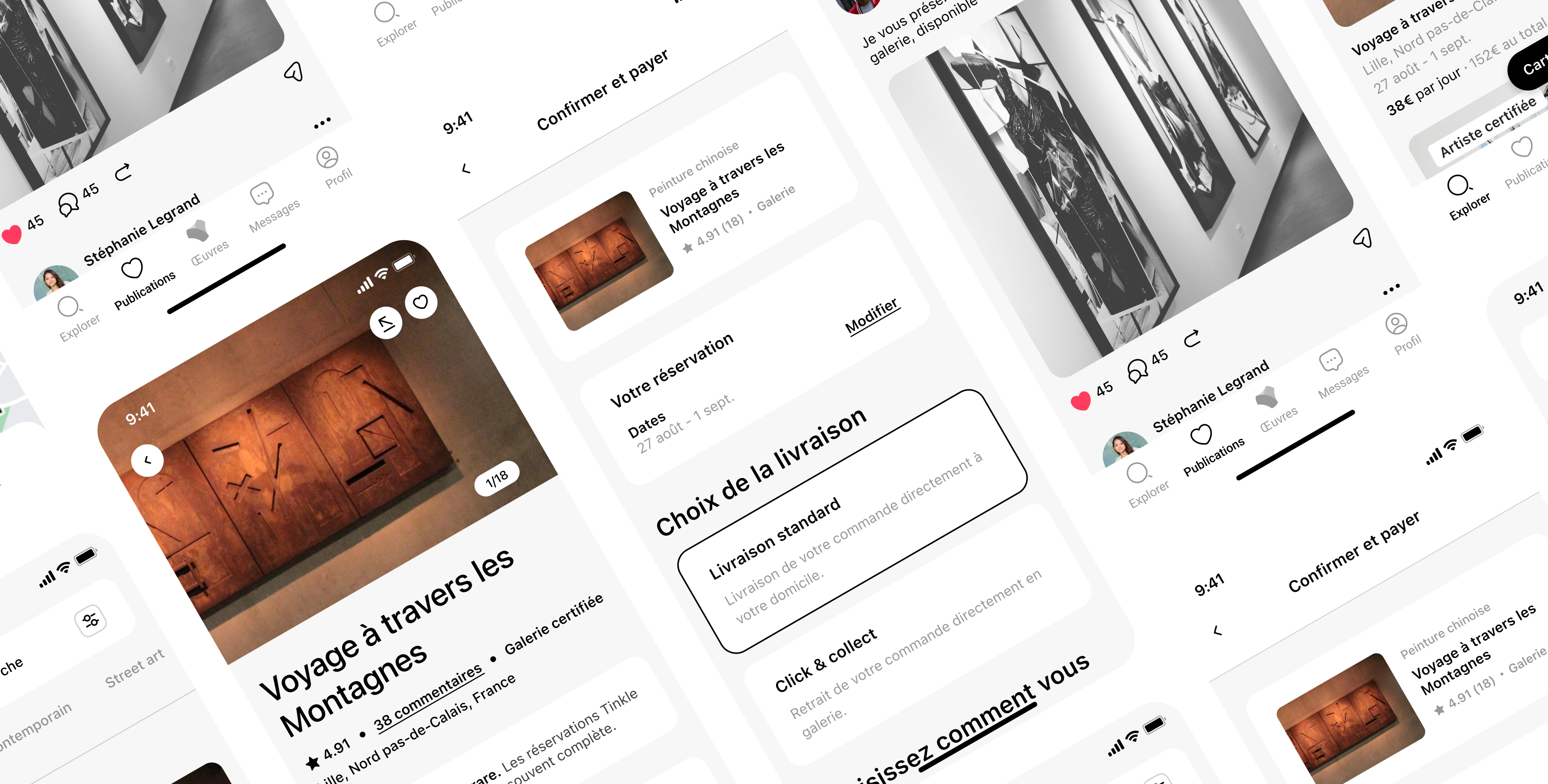
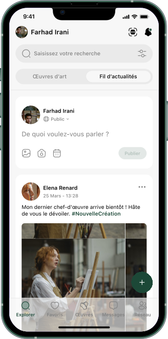
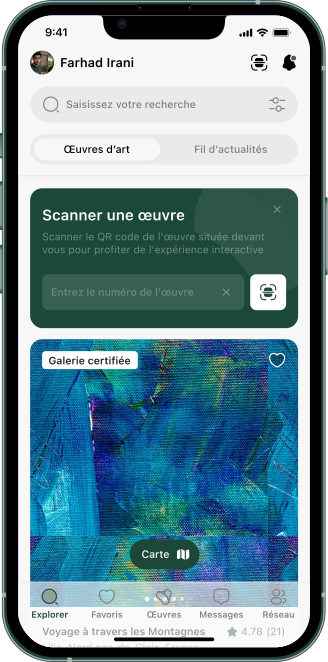
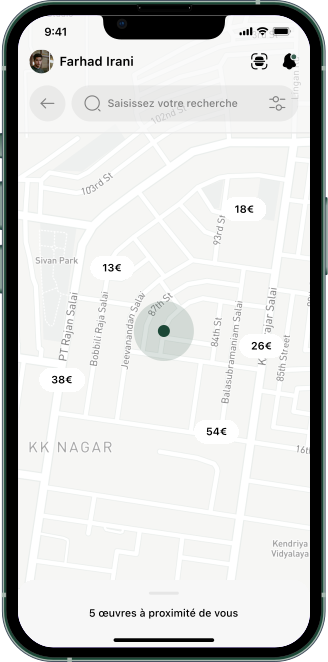
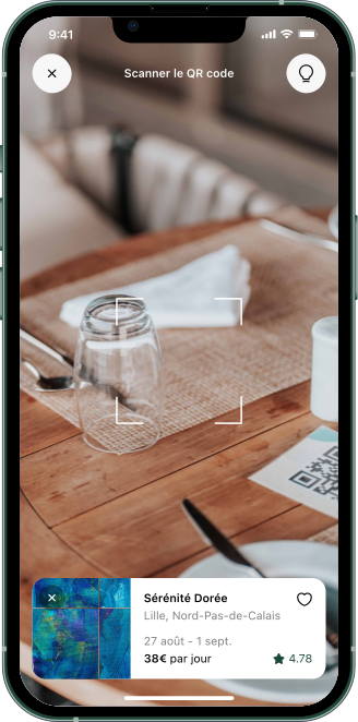
Online buyers browse. In-person buyers explore. Designing one interface for both meant giving each a natural starting point: a curated feed for the first, a proximity map for the second, and an AR scanner that bridges both. Point your phone at a Tinkle-listed piece, get the full context on screen.
The AR was not a feature added for novelty. It was the direct answer to the in-person buyer's core frustration: wanting digital information while standing in front of a physical piece.
The other side of the marketplace
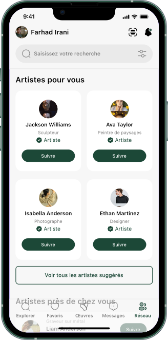
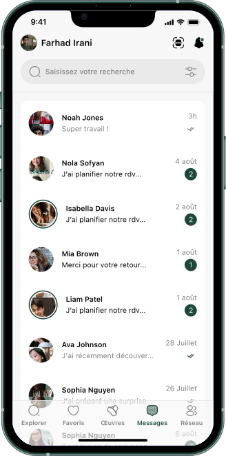
39% of buyers were drawn to the social dimension of buying art. They didn't want a checkout button. They wanted to ask the artist what inspired the piece, whether they take commissions, whether they could visit the studio. So every artist has a profile, a follow system, and a direct message thread. The relationship starts before the transaction, not after.
Rent first, decide later
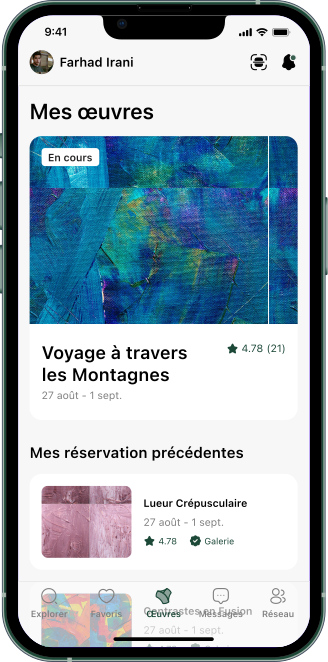
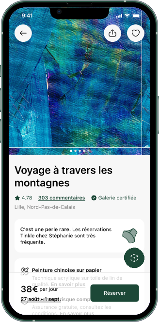
The 64% interest in rental told us something specific: it wasn't about price. It was about reversibility. In-person buyers wanted to live with a piece before committing. Online buyers wanted a lower-stakes way to try. We designed two acquisition paths. Rent handles dates, insurance, delivery. If you love the piece, convert to purchase. For artists, work that would sit in the studio generates income and gets seen.
Designing around the art, not over it
The visual system is deliberately quiet. Dark green on white, generous spacing, no element competing with the artwork. The hardest screen was the map: price markers had to be readable without hiding the geography, and the bottom sheet had to feel like a discovery, not a product listing.
What this project proved
Tinkle was never shipped. It was designed to answer a question we had about an industry we found fascinating, and to push ourselves to run the full process: market research, survey design, user interviews, product definition, interaction design, visual identity. No client brief. No external deadline. Just the standard we set for ourselves.
The biggest lesson was about two-sided marketplaces. Every feature you add for buyers is a feature artists have to understand and trust. That constraint forced us to justify every screen against a real need, not a nice-to-have. And scrapping a full iteration because it didn't match what real users told us was the moment I understood that research isn't a phase you complete. It's the thing you keep going back to when a design feels right on screen but wrong in context.