Lune
An iPhone app that adapts your workouts and nutrition to where you are in your cycle. Built solo in SwiftUI with HealthKit. Fully local: no account, no cloud sync, no data leaving the device.
Solo · design and iOS engineering · SwiftUI · SwiftData · HealthKit · In progress · 2026
Why I'm building it
Most cycle-tracking apps treat the body as a fertility window or a mood diary. Almost none treat it as the variable input it actually is for daily training and nutrition. I wanted something that adapts what I do that day, without coaching me, without selling me supplements, and without uploading my data anywhere.
It's also the first iOS app I'm designing and shipping end to end, on my own with Claude Code. That part is intentional. Building solo in SwiftUI, with no PM and no design handoff, is the most direct way to test what design engineering actually means as a daily practice.
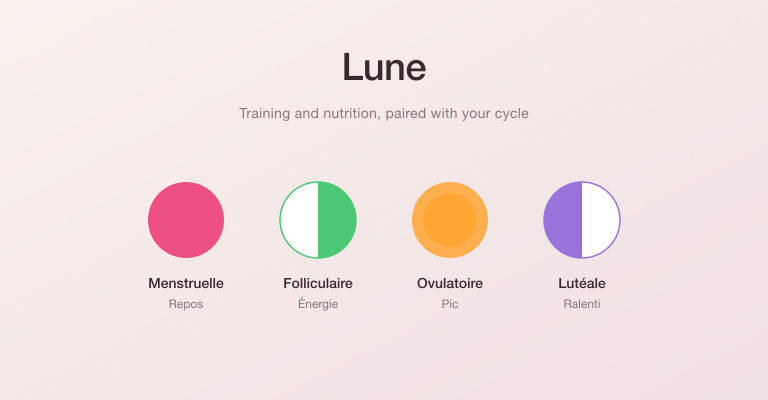
Four phases, four configurations
The product hinges on a single rule: every screen, every suggestion, every recommended session is recomputed from the user's current cycle phase. The phase is read from HealthKit when available and otherwise computed from a local cycle history.
Heavier strength work during the follicular phase. Protein-leaning meals in the luteal. Lighter recovery around menstruation. Each suggestion is editable. The app teaches you what your body wants, then gets out of the way.
A home screen that adapts
The home screen is a stack of cards. Each card is independent, reorderable, and dismissible. The user composes their daily view from the building blocks that matter to them: phase, sport, routine, meals, water, symptoms, weekly report.
Under the hood it's a single VStack of HomeCard enums. The order is stored as a comma-separated string in @AppStorage. Adding a new card means appending one case to the enum and writing one cardView(for:phase:day:profile:) branch. The same pattern scales to a dozen card types without touching the rendering loop.
A palette borrowed from Apple Health
Each phase has a signature color, used consistently across every screen, every chart, every accent line. I wanted the visual system to feel native, not branded. So I picked four colors that sit close to what Apple Health uses for its own categorical distinctions: coral, fresh green, warm amber, soft lavender.
Local first, by construction
Everything Lune knows lives in SwiftData on the device. No account. No sync. No analytics. The decision was technical and ethical at the same time. Cycle data is among the most sensitive categories of personal data, and the easiest way to protect it is to never send it anywhere.
On the engineering side, SwiftData also makes the whole stack simpler. Models are Swift classes. Queries are property wrappers. There's no API layer, no cache, no migration story to worry about. The product fits in a single binary that opens in 200ms.
What this project is teaching me
Designing every screen and then shipping it myself with Claude removes the part of the process where things usually get lost. There's no spec sheet to misread, no annotation to misinterpret. Decisions stay close to the prompt. When a transition feels wrong, I don't file a ticket, I open the file.
It's also slower than I expected, and humbling in a way that client work rarely is. Nobody's around to bail you out of an API choice. The constraint is real. I think that's the whole point.